5 Ways Pros Make Copy Look good

A couple months ago, I interviewed my website designer, Carissa Erickson, about how she took my word-splode and turned it into a beautiful website. Because it's not enough to just have great copy, people have to be able to read and understand it. That's where design comes in.
Once you have your words together, here are the top 5 highlights from our conversation that you can keep in mind when DIYing your design.
You can watch the full video here.
1. Break up the copy on the page with color blocks
Your website (all pages) should be divided into blocks that are about the size of a typical screen. Blocks are like chapters in the story that is your website. Each block moves the story forward and invites the reader to take action (to scroll down, to sign up, to press a button etc).
Blocks can be separated by different background colors. The background colors should match the general color scheme of your website but be lighter shade (no, even lighter) for easy reading.

2. Save script fonts for special occasions
Script fonts are beautiful! They add personality and style to your website. But they are also a bit hard to read and they slow the reader down. In general, you want your website to be an easy read with no friction. So use the script fonts sparingly.
The best way to use them is for a few words or a short sentence when you want to intentionally make your reader slow down, pay attention or when you speak directly to your reader.
Choose the key phrases from your page and make them pop with script font.
3. Infuse your website design with emotional connection (with words and design)

Avoid stock photos whenever possible - the surest way to a meaningful connection is authenticity. Be yourself! And SHOW yourself.
Your website should look like you while also welcoming the reader into your world. Use photos of yourself as part of the theme and design to give the reader a feeling that they're interacting with you personally.
Use words that invite an emotional response. Highlight the best parts of what you offer with different fonts and styles (such as the script fonts). Create a feeling of a discussion between you and the reader.
4. Use graphics on your website sparingly
Graphics aren’t just ‘jewelry’ for your website; they’re not just pretty, they serve a purpose. Graphics are meant to highlight the words, but if you get too “busy” you can make it harder for the reader to focus. Less is more here - keep it simple!
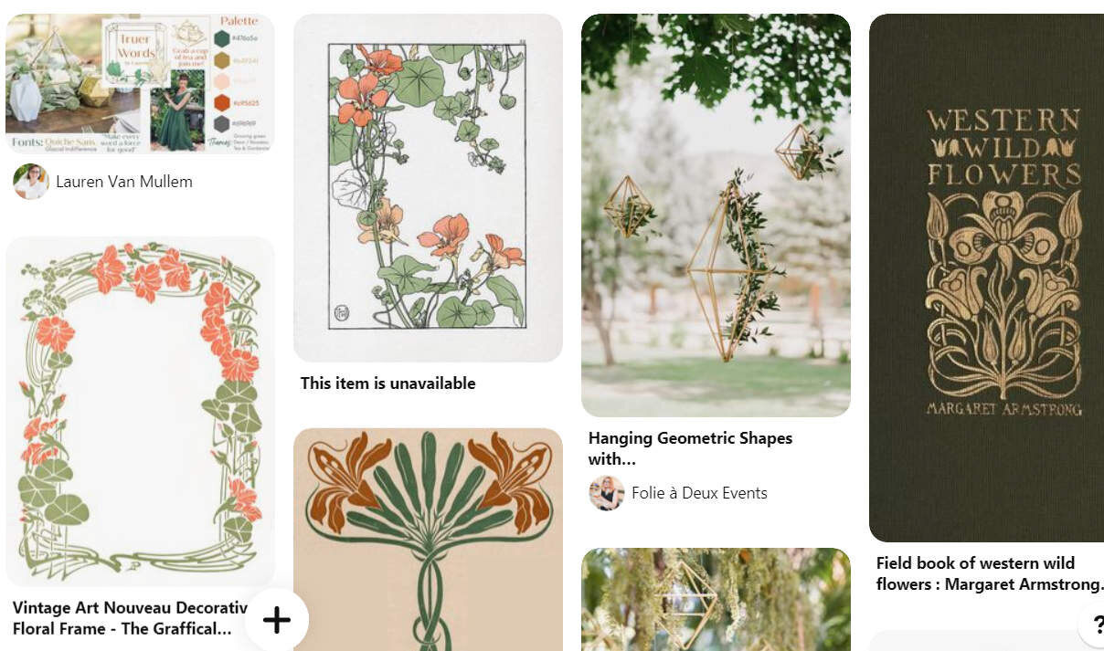
Use a vision board (mine’s on Pinterest) to narrow down the key themes, colors and images that represent your brand and only bring the best of the best to your site.
Stick to a few key graphics that really accentuate your message. You’ll notice that my website design is MUCH simpler than my Pinterest board!
5. No logo is A-okay
Logos are fun. It's cool to have a logo for your business and to use it on the top of your website. But, you don't really need a logo. Your name or your business' name is fine. Choose a nice font and you’re done.
I’ve seen far too many entrepreneurs get stuck on their logo design, using it as an excuse not to move forward with their business, or spending a ton of money on a logo that they don’t really need (when they could use that money on much more important business expenses!). I didn’t have a logo for a long, long time (like 10 years). Didn’t hurt me a bit.
Really, if you're just getting started on your business, a professionally designed logo is just a bonus (and an extra expense) and should be treated as such. Focus your energy on key elements, like getting the copy right and designing your website for clarity.
If you have questions on how to put your words into your website template so they look good, I'd love to hear them so I can answer them in my next video! Tell me your thoughts at Lauren@Truerwordsbylauren.com